About the project
A wholesale supermarket made
simple for volume buyers
Santa María is a wholesale supermarket that serves business owners,
resellers, and the general public looking to buy in bulk.
With both an institutional website and an online store already in place,
they needed to enhance their digital presence to better connect with
customers and improve the shopping experience.
the problem
Enhancing online usability and branding
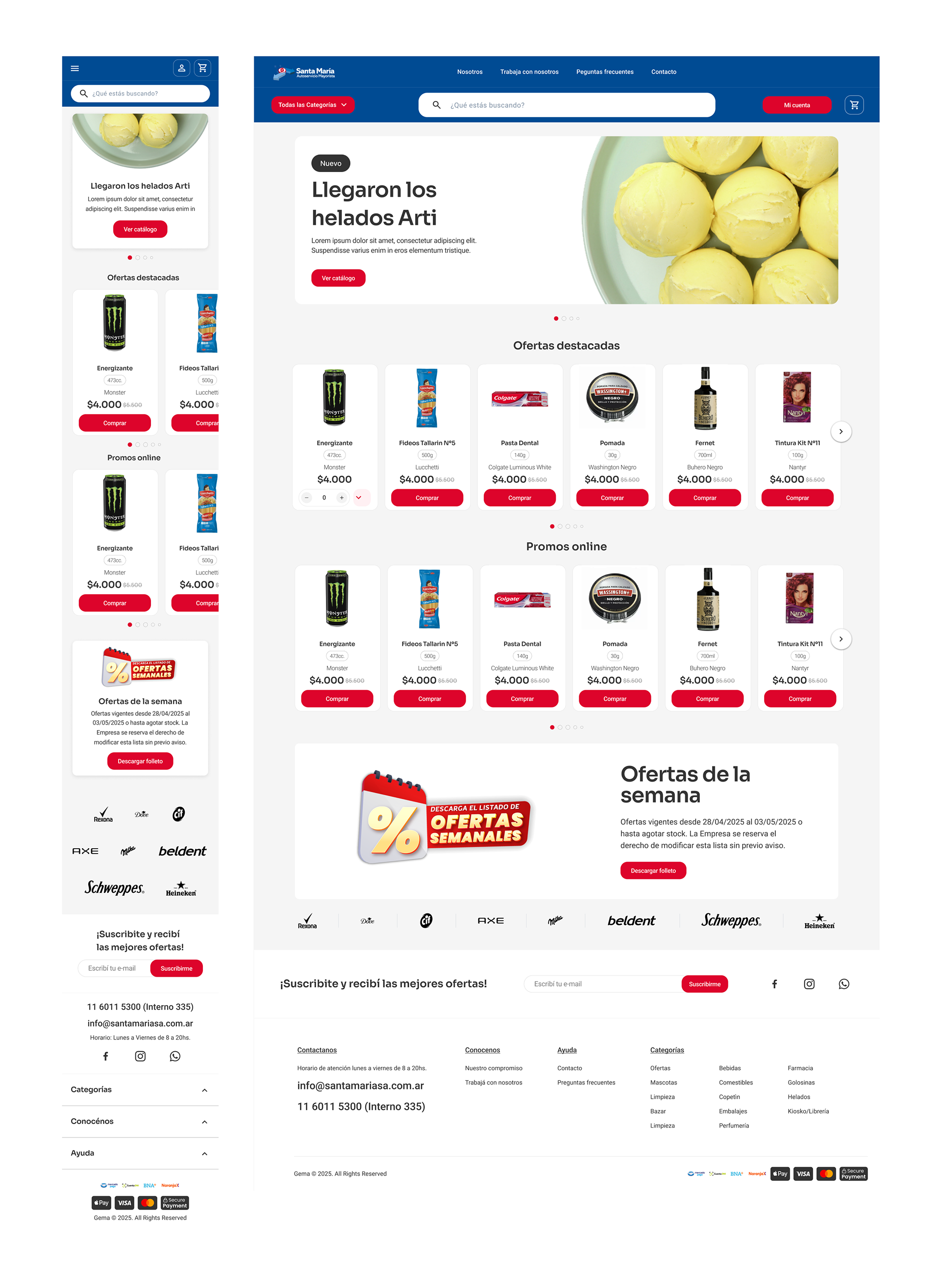
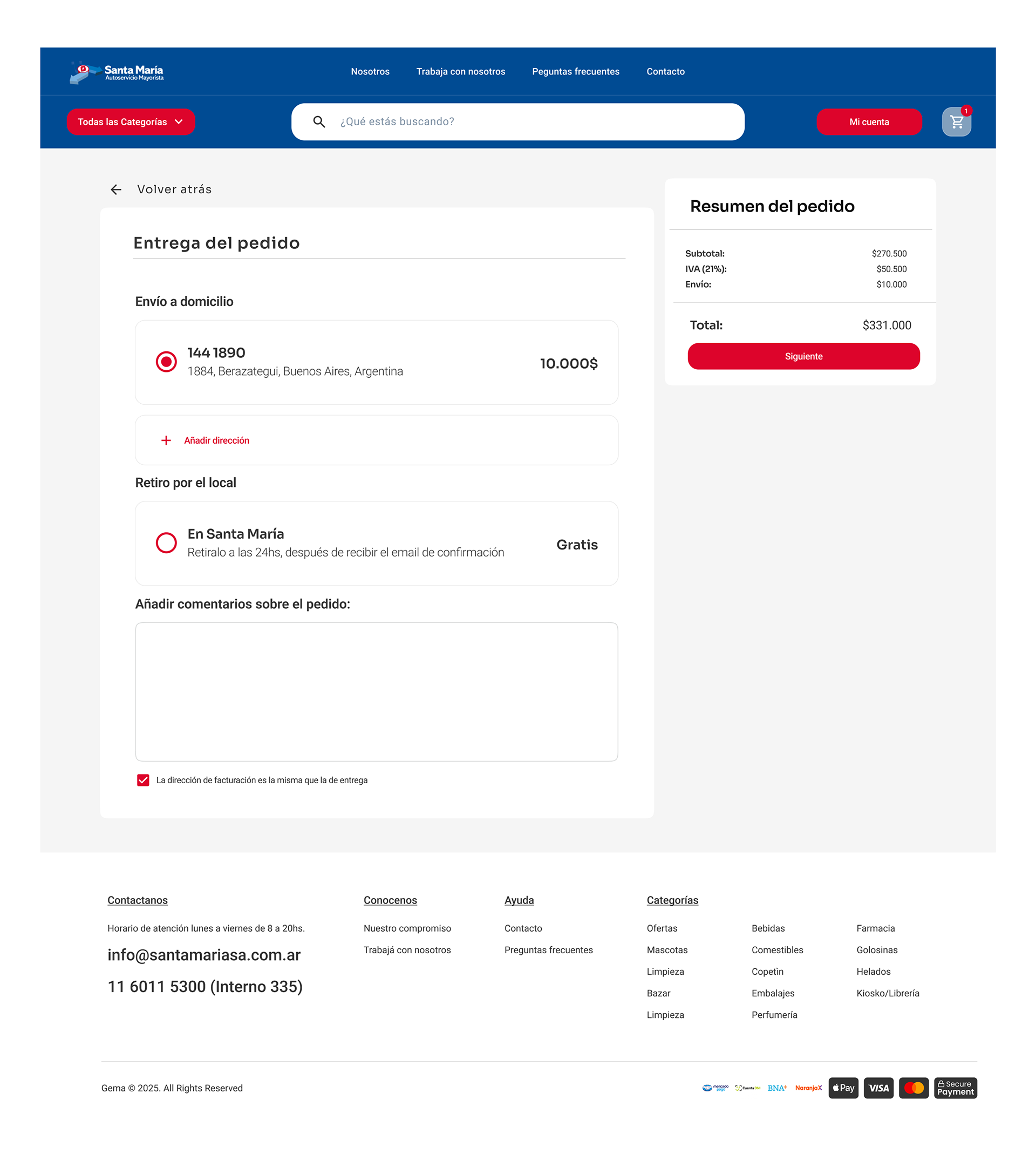
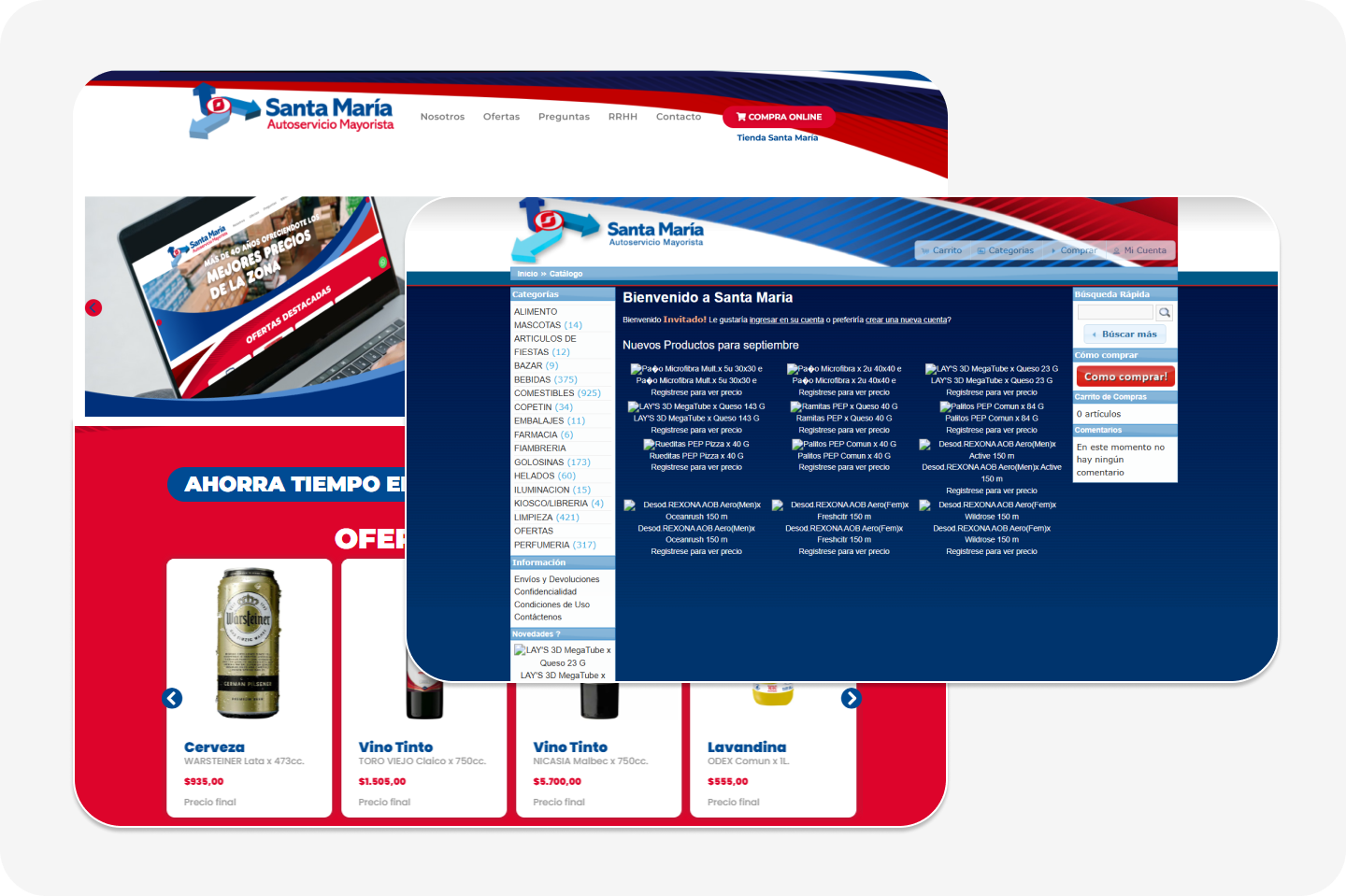
Santa María, a leading wholesale supermarket in Argentina, had a strong physical presence but a fragmented online experience. Users clicking “Shop Online” were redirected to a separate domain, creating disconnection, visual inconsistencies, and navigation challenges. To modernize the brand and refresh its digital image, I unified the corporate site and online store under a single website, updating colors, typography, headers, and footers to create a cohesive, contemporary look and a seamless, user-friendly shopping journey.
Navigation and conversion issues
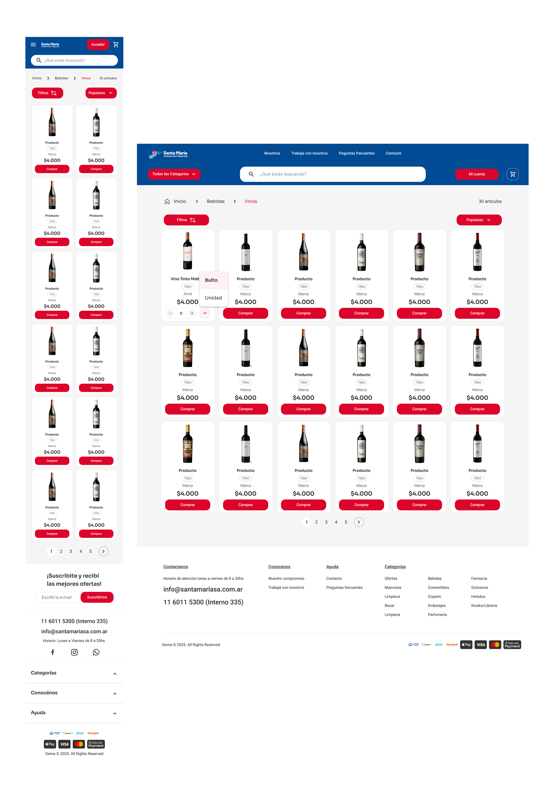
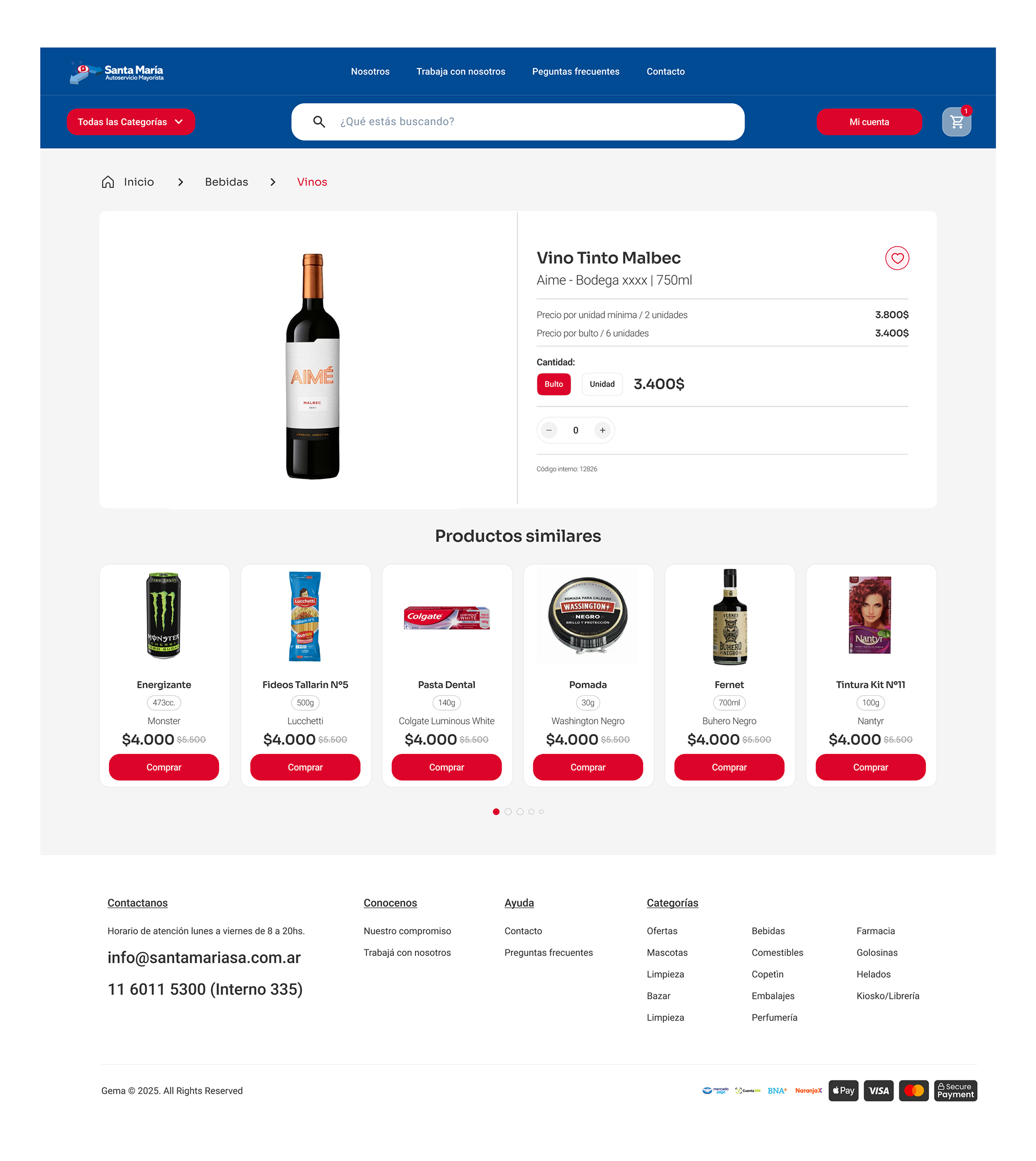
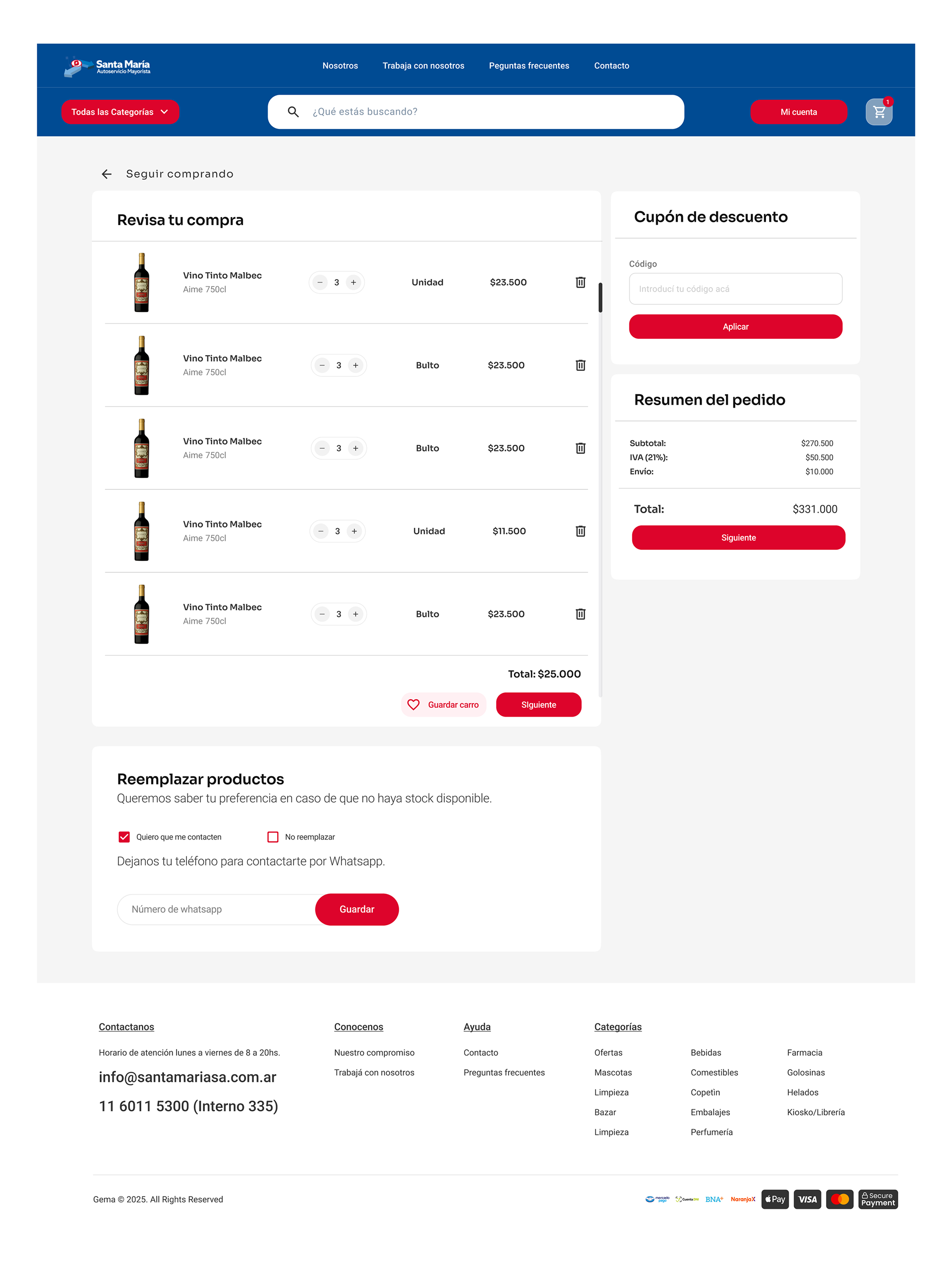
Santa María serves a large audience of business clients, resellers, and bulk shoppers, but the existing website and online store had untapped potential to drive more purchases. Optimizing the user experience and making it easier to navigate and buy became a top priority.
Keeping customers coming back
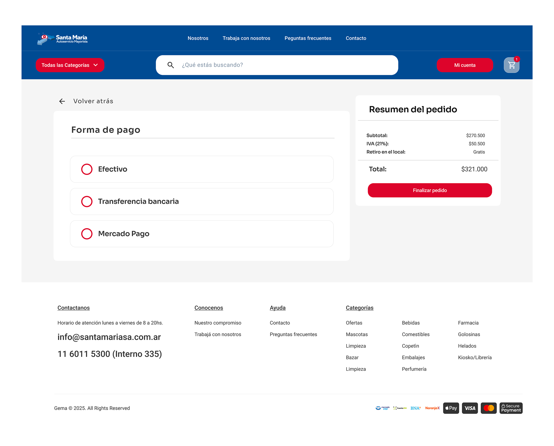
A key goal was to position Santa María as the preferred choice for businesses and bulk buyers. I aimed to make it easy for users to return whenever they needed to restock or plan purchases. To achieve this, I improved site navigation, streamlined the online shopping experience, ensured visual consistency across all sections, and optimized performance for faster, more reliable interactions.
Analyzing the Market
Strengths and gap
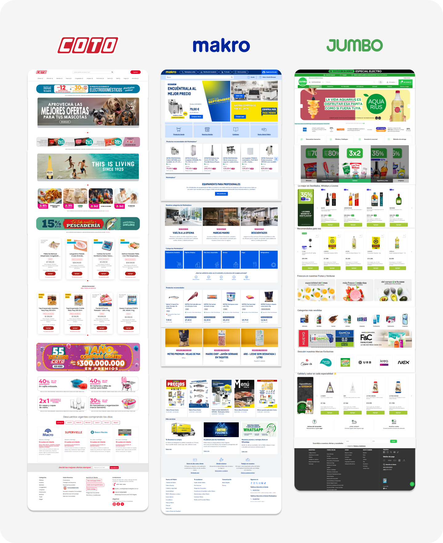
To better understand how wholesale supermarkets handle online shopping, I researched Santa María’s main competitors, examining their user interfaces, user experience, navigation flows, and information structure. This analysis revealed key opportunities and challenges, which helped me shape the direction of the project and make design decisions with confidence.
Visual consistency
Modernizing the brand identity
Santa María needed its online presence to communicate three key aspects: clarity, trust, and accessibility for both business customers and resellers.
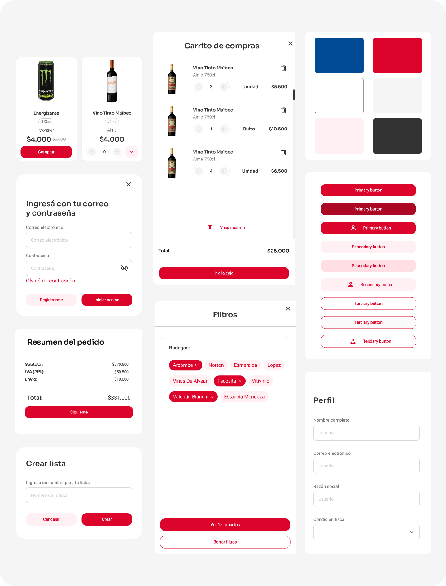
By unifying colors, typography, headers, and footers across the corporate site and online store, the brand now conveys a modern, cohesive, and reliable image that aligns with its strong physical presence.
UX AUdit | IMPROVING THE UX
Restructuring for clarity
The old website was cluttered with excessive images, colors, redundant content, and banners, making navigation overwhelming and fragmented. I redesigned the information architecture to prioritize clarity and usability, supported by a minimalist and consistent design. A persistent search bar and well-defined filters simplify browsing, while smart navigation patterns make the experience intuitive, efficient, and conversion-focused.
Accessibility
The website shows several accessibility issues that affect usability for people with disabilities. Many images lack descriptive alt text, making content unclear for screen readers. Low text–background contrast in some areas risks poor readability, while the absence of ARIA roles and labels limits support for assistive technologies. Navigation is not fully optimized for keyboard use, and there are no options for adjusting text size or enabling a high-contrast mode, which reduces overall accessibility and inclusivity.